My extensive list of skills
HTML & CSS
Duis aute irure dolor in reprehenderit in voluptate.
Javascript
Ut enim ad minim veniam, quis nostrud exercitation.
React JS
Lorem ipsum dolor sit amet, consectetur adipiscing elit.
Node JS
Excepteur sint occaecat cupidatat non proident ame.
Webflow
Duis aute irure dolor in reprehenderit in voluptate.
How to Ace UI/UX Whiteboard Challenges: A 5-Step Framework

Whiteboard challenges are one of the most nerve-wracking parts of a UI/UX interview. You get a marker (or a blank FigJam/Miro board), 30-45 minutes, and a vague brief. The goal of this guide is to turn that pressure into a structured approach you can rely on every time. This post distills a short video by Rohan Mishra into a clear, step-by-step playbook you can practice and use in interviews.
Table of Contents
- Why Whiteboard Challenges Matter
- Common Mistakes Designers Make
- The 5-Step Framework to Win the Whiteboard Challenge
- How to Present Your Whiteboard Design
- Key Tips: Think Out Loud & Collaborate
- Quick Checklist to Use During a Whiteboard Challenge
- Conclusion
- FAQ
Why Whiteboard Challenges Matter
Interviewers use whiteboard challenges as an X-ray of your design brain. They are not just judging your sketches — they want to see:
- How you clarify and scope a problem
- Whether you think about the user and context
- How you communicate assumptions and trade-offs
- Whether you consider technical constraints and implementation
- How you collaborate and respond to feedback
When being recruited, the aspect you should be aware of is that the fellow candidates will see your performance in the task you are given and that experience will reflect your work. Instead of focusing on making 15 perfect ideas, you should demonstrate your reasoning, illustrate the options, and tell the story of the problem and the solution in a clear way.
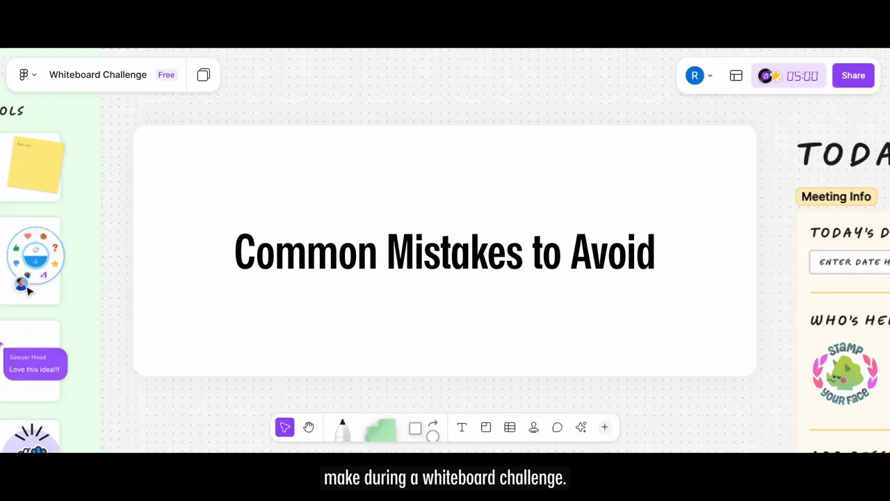
Common Mistakes Designers Make
Mistakes that you need to refrain from before you embark on the procedures are as follows:
- Jumping straight to the solution: Sketching before understanding the problem is like cooking without the recipe.
- Unreadable sketches or labels: Your drawing doesn’t need to be art, but it must be legible and self-explanatory.
- Going silent: If you draw in silence you miss the chance to show your thought process and collaboration skills.
- Trying to solve everything: Focus on one clear use case rather than scattering effort across many.
- Getting defensive: Questions are opportunities to explain and refine your thinking, not attacks.
The 5-Step Framework to Win the Whiteboard Challenge
This practical checklist consists of five steps that make it to easier embrace a live Whiteboard interview.
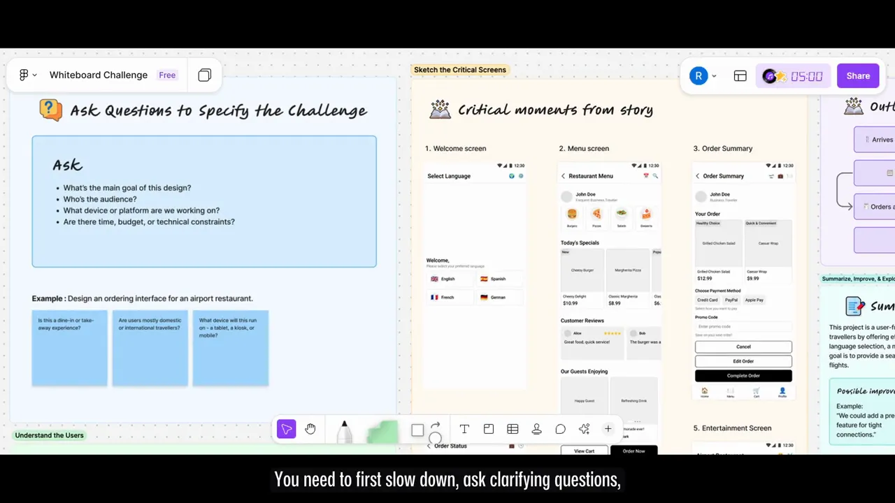
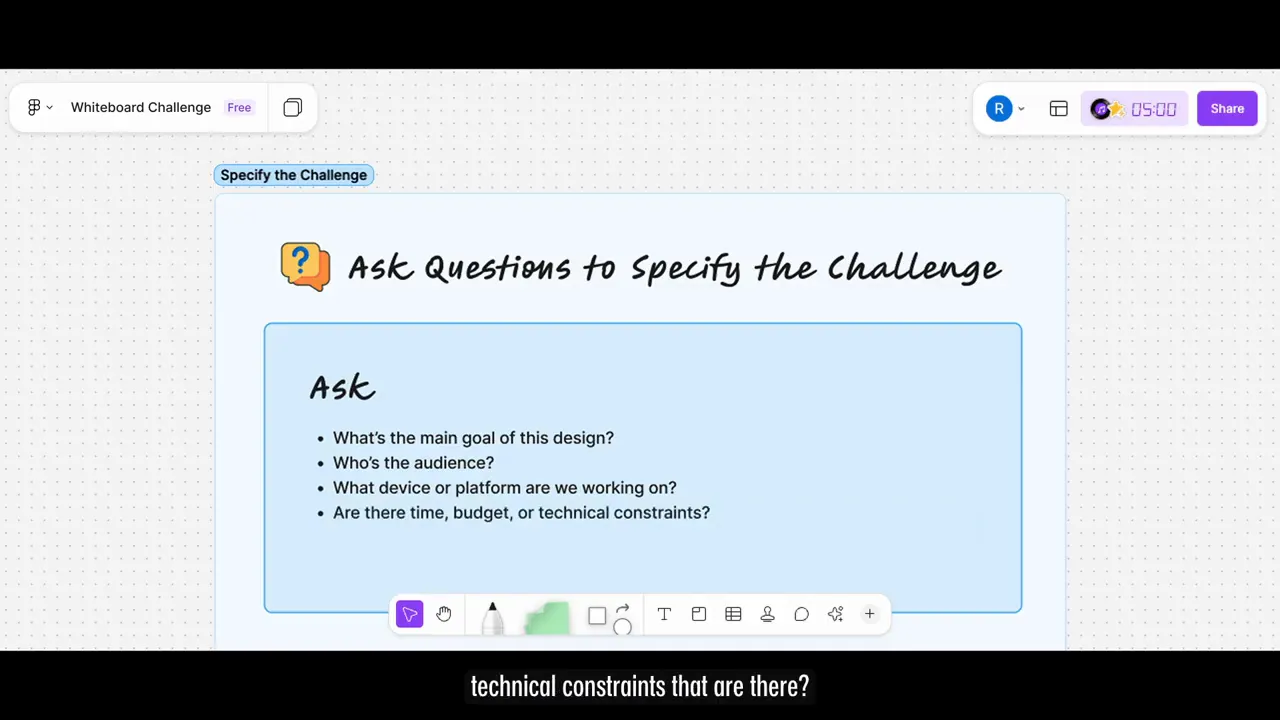
Step 1 — Ask Clarifying Questions
Ajayi believes that it is a great practice to initially ask questions and scientifically define the limit before you make your sketch. By doing just this one act, especially you turn your focus onto the problem, and in addition, it puts you in a state where you can think about what might be the solutions to the problem.
- What is the main goal of this design?
- Who is the audience / persona?
- Which devices or platforms will this run on?
- Are there time, budget, or technical constraints?
The assignment involves the creation of an online ordering platform for a restaurant which is based in an airport. This entails the requisite hardware and software components for the configuration of this system.
- Is this for dine-in or takeaway?
- Are users mostly domestic or international travelers?
- Will it run on a kiosk, tablet, or users’ mobile phones?
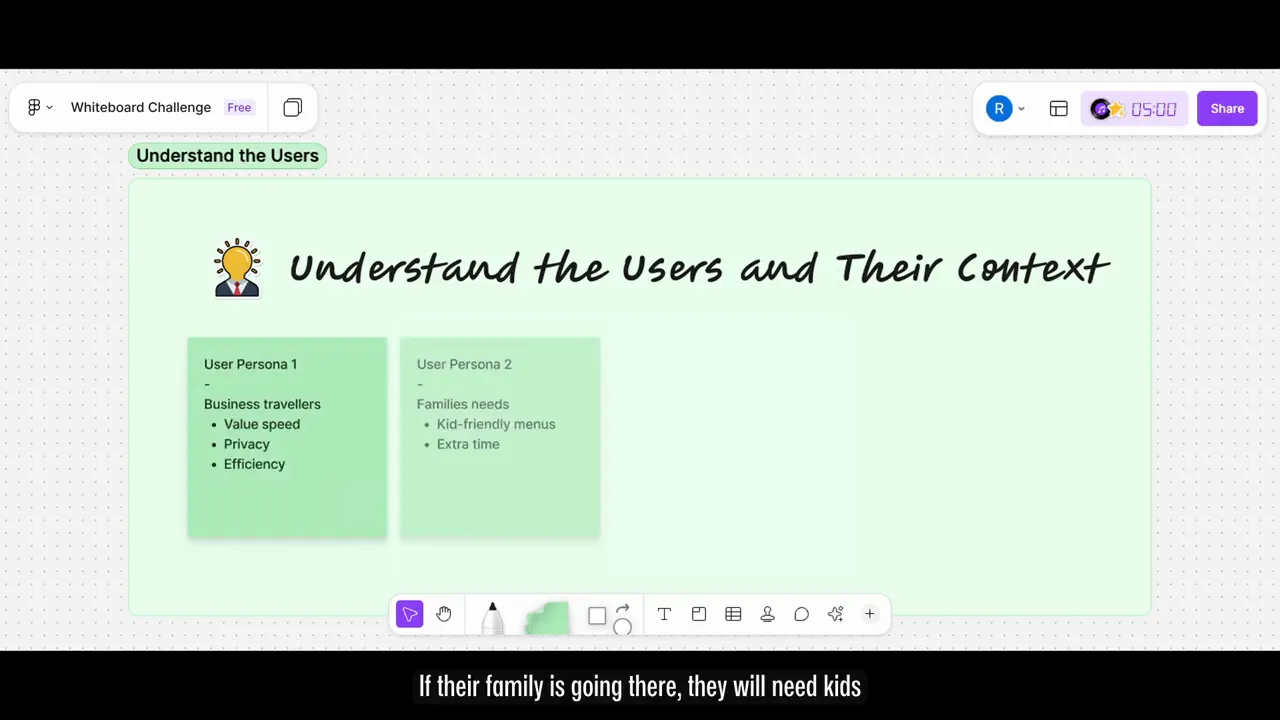
Step 2 — Understand the User and Their Context
Among all the users mentioned, I have selected a user design for an ecologically-minded traveler whose primary goal is to minimize their ecological footprint. These travelers prefer green and natural accuimation facilities such as ecological lodges or cabins with solar energy rather than conventional hotels. Also, they aim to participate in outdoor activities like hiking, canoeing, or volunteering at parks with environmental organizations. They are also interested in accompaniments like public transport buses, bicycles or trains as sustainable and responsible means of travel.
- Business travelers: speed, privacy, efficiency
- Families: kids-friendly options, extra decision time
- Solo leisure travelers: exploration and entertainment
Choose one persona to keep your design focused. This also helps you tell a clear story when presenting.
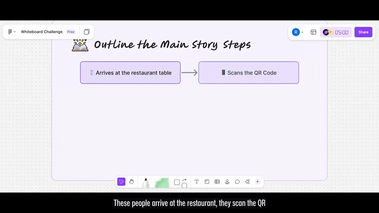
Step 3 — Outline the Main Story (User Flow)
Immediately after I arrive, I will take my bags, my cellphone, and my boarding pass, and directly go to the boarding gate to wait for my flight. The first thing I would do is to examine the restaurant menu. The second action I would take is to determine what I want to eat. The last thing I would do is to place my order at the counter of the restaurant.
- Arrive at restaurant
- Scan QR code for menu
- Select language
- Browse menu and quick-add items
- Order and pay with card
- Check order status and pick up
The spine of this flow is the one that holds all the extra features at arm's length and it is only focused on what is important for the selected persona.
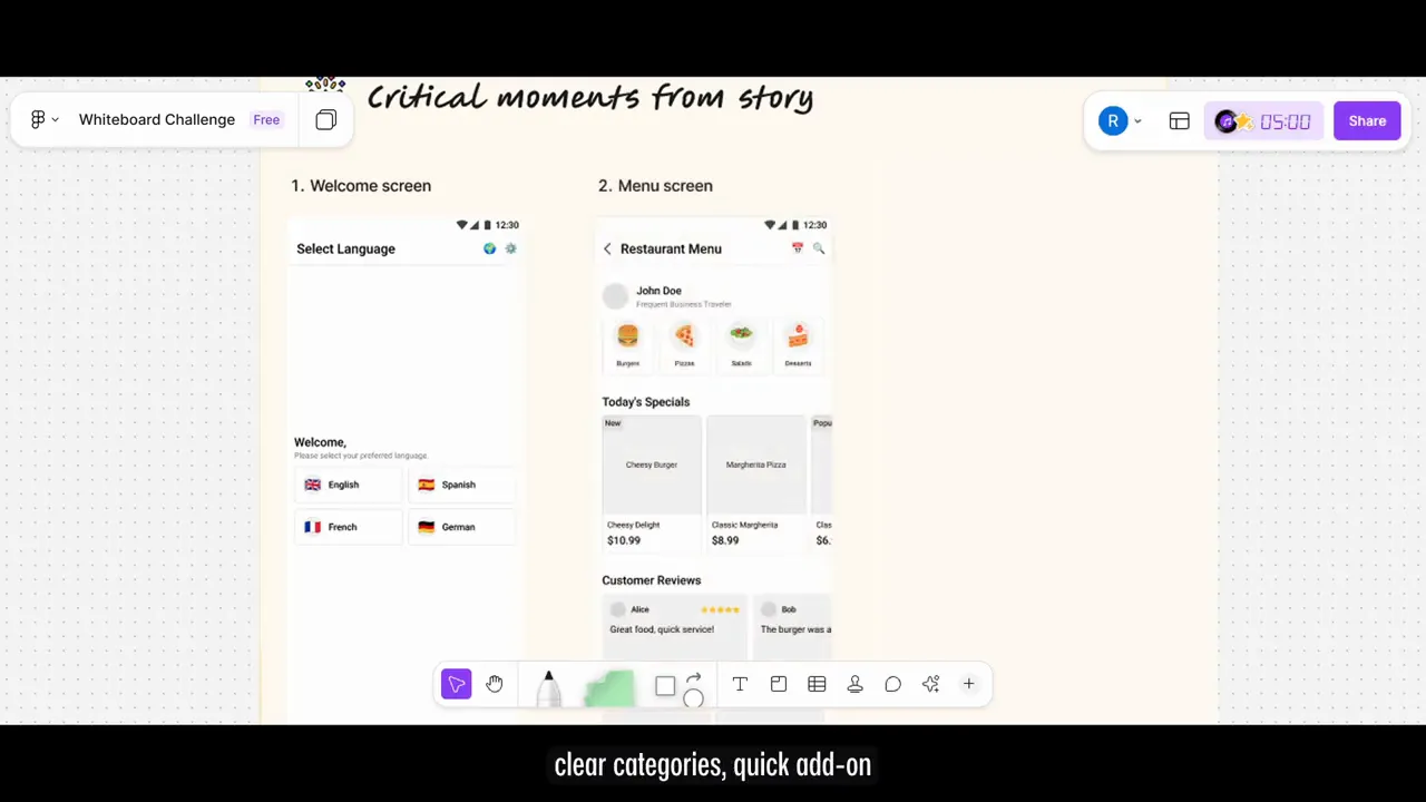
Step 4 — Sketch Critical Screens
Create a basic outline of the principle events necessary for your layout, which will also be used as the storyboard. Use clear markings for everything, straight lines, and full words apart from maintaining good spacing. You really do not have to give a pixel-perfect UI.
1 box mobile screen: Select your screen's delivery option, and then you will see the button that can be used for you to call the service. 1 or 2 boxes web screen: At the delivery place of the web screen, you should have a seat. Before you take your seat, you must find out the payment method you want first. 2 box tablet screen: The first step is to book or go to a cellular store. For lunch, you can choose to do a food refresh menu. Peppers and Mushrooms add BFG. Your order will be on the table when you wait.
- Welcome / Language selection (after scanning QR)
- Menu with clear categories and quick-add options
- Order summary / review
- Payment screen
- Order status with progress bar and flight-info widget
- Optional entertainment or boarding alerts screen (for leisure case)
The elements such as "Scan QR", "Quick Add", "Pay with Card" along with any presumption have to be marked. (for instance, "uses airport Wi‑Fi" or "supports multiple languages")
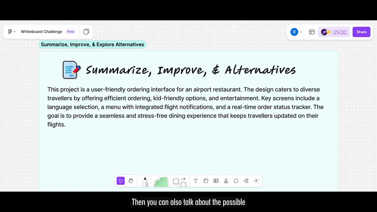
Step 5 — Summarize, Improve & Discuss Alternatives
Please go through the travel itinerary you have prepared once again, and then present the main trade-offs, and also the next steps to be taken.
- Why you prioritized speed (business traveler) over exploratory features
- Potential improvements: pre-order for tight connections, family-mode with kids menu
- Constraints to validate: airport Wi‑Fi reliability, payment terminal integrations
Opting for the topic of options as the conversation subject evidences your nontraditional thinking as well as your ability to look at the product ecosystem in a holistic way.
How to Present Your Whiteboard Design
Just as a design's importance is, so is a presentation. Thus, you should use this method as well while you give the summary of your speech.
- Talk through the persona and context first.
- Explain the main story / flow next.
- Walk through each critical screen and call out the rationale behind decisions.
- Summarize trade-offs, next steps, and validation areas.
To put it in simple words, you have flaws, which can be compared to the collages that you make which may not be in the design that you prefer. The truth is, the audience’s image that you create by referring to a theme and the example they get is so attractive that they visualize it themselves and share their creative ideas.

Key Tips: Think Out Loud & Collaborate
The mission is a complete cooperation simulation. Kindly act according to the following behavioral principles:
- Constantly verbalize your thoughts: "I'm thinking out loud—here's what I'm doing."
- Treat feedback as a chance to adapt, not to defend.
- Stay calm and curious when interviewers throw new constraints.
- Show you can make trade-offs and prioritize.

Quick Checklist to Use During a Whiteboard Challenge
- Slow down and clarify: ask 3-5 focused questions
- Pick one persona and one core use case
- Write a short user flow before sketching
- Sketch only critical screens; label everything
- Summarize decisions, trade-offs, and possible improvements
- Keep talking—it's a collaboration, not a solo test
Conclusion
In case during an interview, the interviewer mentions "let's do a whiteboarding challenge," instead of going into a panic, you can employ this five-step process: 1) pose your clarifying questions, 2) grasp the user's context, 3) draft the user story, 4) sketch the core screens, and 5) finally, present it along with the other options. Moreover, it is imperative, that you communicate with the interviewer by sharing your thoughts, encouraging the dialogue, and also demonstrating your collaboration.
The basic principles mentioned in this manual were prepared primarily by Rohan Mishra who provided the original motivation for this framework that I got from his video.
FAQ
How long should I spend on each step?
The estimated time of 30-45 minutes would be filled by around 5 minutes for clearing and questioning, 5 minutes for persona and flow definition, 15-20 minutes for screen sketching, and at most 5-10 minutes for summarizing and feedback management.
What if the interviewer keeps adding constraints?
Stay calm. First get the particular information, then discuss the advantages and disadvantages directly and, accordingly, finally mention your alternate solution to the sequence or the priorities in a practical way. This indeed reflects your flexibility and teamwork.
How much detail should my sketches include?
You should add certain key factors that are required for the full transfer of the idea. These elements include the screen title, the main elements, the call to action buttons, and some annotations that give information about the expected behavior or extreme situations. Each button does not need to be your specific design.
Should I try to design for multiple personas?
A student scholarship grant recipient is one type of persona. This case is about a student who has financial issues but he is very smart and he obtains a scholarship because of his brilliant results. For instance, the scholarship application form can be created in a way that it shows not only the essential details about the applicant's personal particulars but also the options of numbering from zero to five items that an applicant can choose and to add them to the application in any file format. This feature would permit the applicant to be his/her own advocate.
What if my handwriting or drawing is bad?
It should work without any problems for you. Use whole words, variable labels, square buttons, and correct space every time you do not forget. The line that is more important is it is more readable than the look.
How do I handle implementation or technical questions?
Propose the formation of collaboration with engineers and product managers .Identify the defects in a brief way and present alternative solutions.Practical alternatives for` or`Ask for verification`.