
My extensive list of skills
HTML & CSS
Duis aute irure dolor in reprehenderit in voluptate.
Javascript
Ut enim ad minim veniam, quis nostrud exercitation.
React JS
Lorem ipsum dolor sit amet, consectetur adipiscing elit.
Node JS
Excepteur sint occaecat cupidatat non proident ame.
Webflow
Duis aute irure dolor in reprehenderit in voluptate.
Mastering Typography: How to Choose the Right Fonts for UI/UX Design
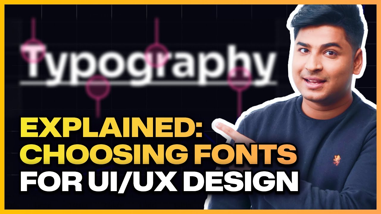
Picking the perfect font is one of the most crucial yet challenging aspects of typography in design. The right font can elevate your design to be delightful and user-friendly, while the wrong choice may make it frustrating and disliked. Whether you’re designing a bold 72-point headline or a tiny 10-point body text, the font you choose needs to shine in every context. In this article, inspired by Rohan Mishra’s expert insights, we’ll explore the essential characteristics of great fonts, different font types, how to select fonts for your projects, and where to find them. Whether you’re a beginner or a seasoned designer, mastering typography will sharpen your UI/UX design skills.
Table of Contents
- Characteristics of a Great Font
- Pro Tip: Adjust Line Height Based on Font Size
- Recommended Fonts That Follow Best Practices
- Understanding Fonts vs. Typefaces
- Types of Fonts and Their Use Cases
- How to Evaluate Fonts for Your Design
- Where to Find Great Fonts
- Conclusion
- Frequently Asked Questions (FAQ)
Characteristics of a Great Font
Before diving into font types and recommendations, it’s important to understand what makes a font truly great. According to Rohan Mishra, there are three key characteristics:
1. Legibility
Legibility is about how easily each individual letter can be recognized. A highly legible font ensures that even small or closely spaced letters are clear without causing eye strain. For example, a font where the lowercase “l” doesn’t look like the uppercase “I” scores high on legibility.
2. Readability
Readability refers to how easy it is to read a full sentence or paragraph. This depends on the spacing between letters and words, as well as factors like font size, font weight, line height, and contrast. A readable font helps users distinguish where one word ends and another begins, making long blocks of text comfortable to scan and understand.
“While both legibility and readability contribute to a great font, legibility focuses on individual letters, whereas readability is about the overall experience of reading text.”
3. Versatility
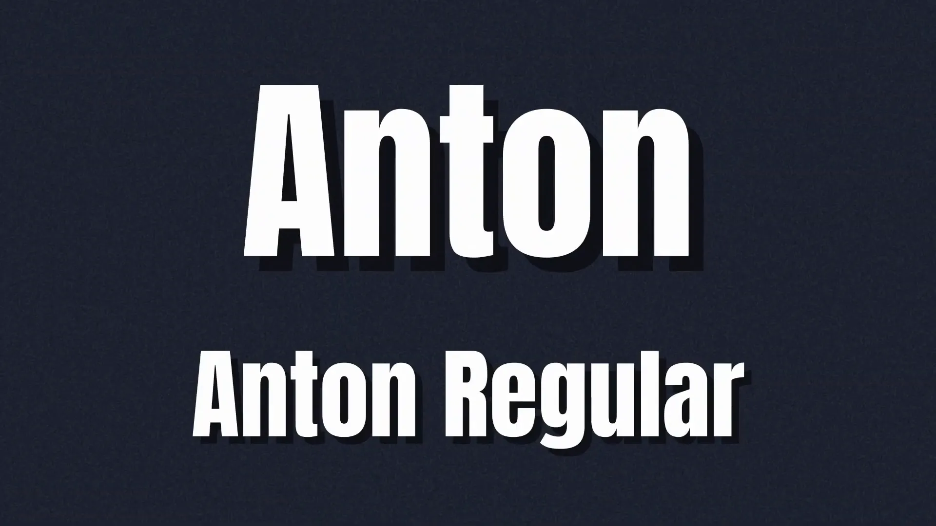
Versatility measures how well a font performs across different contexts and platforms. Can it be used for both digital and print media? Does it come in multiple weights (bold, regular, light, etc.) to add flexibility to your design? For example, the font Anton works well for headings but lacks versatility for body text because it only has one weight.
Pro Tip: Adjust Line Height Based on Font Size
A common mistake designers make is keeping line height constant regardless of font size. The rule of thumb is:
- Smaller fonts need larger line height to maintain readability.
- Larger fonts can have smaller line height.
Using percentages for line height rather than absolute values gives you more control and better visual harmony.
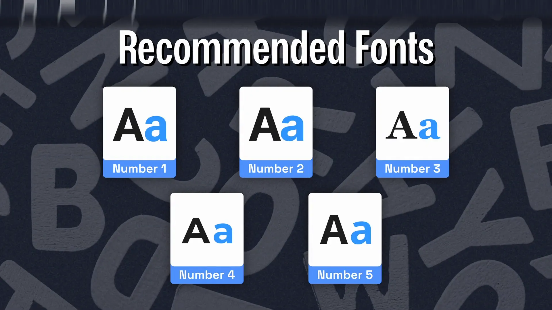
Recommended Fonts That Follow Best Practices
Here are some fonts that excel in legibility, readability, and versatility, making them great choices for UI/UX design:
- Roboto: A versatile font with multiple weights and clear letterforms, suitable for both headings and body text.
- Inter: One of Rohan’s favorites, Inter offers great readability at various sizes and weights, ideal for digital interfaces.
- Georgia: A classic serif font used by Medium for blogs and articles, combining readability with a formal tone.
- Montserrat: Highly flexible and popular in live apps and websites, Montserrat supports multiple weights.
- Open Sans: Recommended for body text, Open Sans also supports various weights, allowing consistent typography across headings and paragraphs.
Understanding Fonts vs. Typefaces
It’s common to use “font” and “typeface” interchangeably, but there is a subtle difference:
- Typeface: The design family, e.g., Roboto, Anton, Raleway.
- Font: Specific styles within a typeface, e.g., Roboto Bold, Roboto Regular, Roboto Medium.
To keep your design clean and professional, avoid using more than two typefaces in a single project.
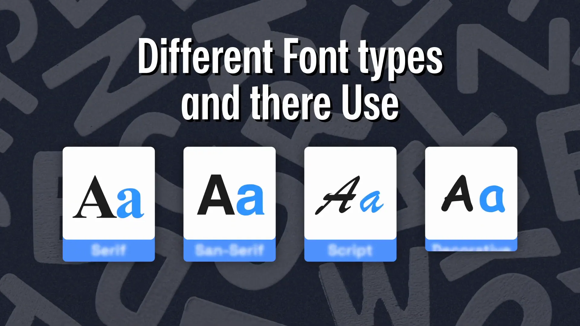
Types of Fonts and Their Use Cases
Fonts can be broadly categorized into four types, each suited for different purposes:
1. Serif Fonts
Serif fonts have small strokes or “tails” at the ends of characters. They are among the oldest font styles, originally designed for print media. Serif fonts convey tradition, respectability, and reliability, making them ideal for formal documents, academic papers, books, and newspapers.
Popular serif fonts include Times New Roman, Garamond, Georgia, and Bodoni.
2. Sans Serif Fonts
“Sans” means “without” in French, so sans serif fonts lack the tail strokes of serif fonts. Their clean, minimalistic, and modern appearance makes them highly legible and readable, especially on digital screens. This is why many digital products, apps, and websites use sans serif fonts.
Common sans serif fonts include Helvetica, Arial, Montserrat, and Inter.
3. Script Fonts
Script fonts mimic handwriting and are often used for luxury brands or celebratory materials like wedding invitations. They create a vintage or retro feel but should be used sparingly to avoid readability issues.
Examples include Rushscript, Lucida Calligraphy, and Zapfino.
4. Decorative or Display Fonts
These fonts are playful, unique, and designed to stand out. They work well for advertising, packaging, or when you want a memorable visual impact. However, overusing decorative fonts can harm readability and user experience.
Popular decorative fonts include Comic Sans, Gills MT, and Harrington.
Note: Some fonts blur the lines between categories, so always choose fonts that fit your brand personality and project purpose.
How to Evaluate Fonts for Your Design
When selecting a font, consider these five factors:
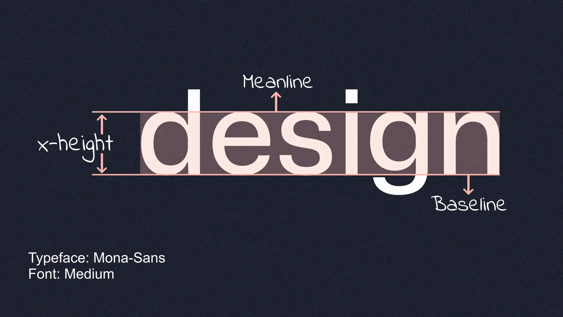
- X-Height: The height of lowercase letters. Larger x-heights improve legibility, especially at smaller sizes.
- Distinct Letterforms: Choose fonts where letters are easily distinguishable, avoiding confusion (like “O” vs “0”).
- Readability: Pay attention to kerning (space between letters) and leading (line height). Both should be balanced—not too tight or too loose.
- Flexibility: Multiple weights and styles offer more creative freedom and help create visual hierarchy.
- Fitness for Purpose and Brand: A font might be great, but if it doesn’t align with your brand’s personality or project’s tone, it won’t work effectively.
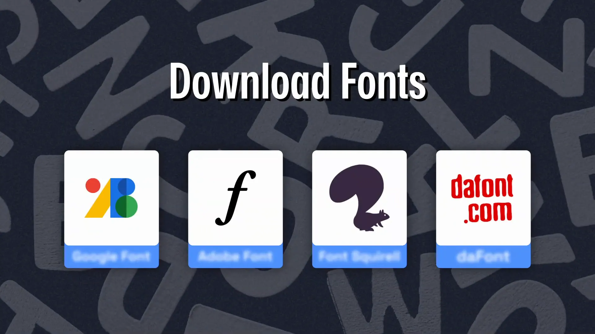
Where to Find Great Fonts
Once you know what to look for, here are some reliable resources to download fonts for your projects:
- Google Fonts: A vast library of open-source fonts free for any project.
- Adobe Fonts: A professional-quality font catalog available with a paid subscription.
- Font Squirrel: Free fonts curated for commercial use.
- The Font: A lesser-known site offering a wide range of unique fonts for personal and commercial use.
Conclusion
Typography is a fundamental pillar of design, especially in UI/UX where clarity and user experience are paramount. By understanding the characteristics of great fonts — legibility, readability, and versatility — and the different font types, you can make smarter choices that elevate your design. Remember to pick fonts that align with your brand personality and project goals, and use no more than two typefaces for a clean, cohesive look.
Explore the recommended fonts and resources shared here to build a versatile typography toolkit. Happy designing!
Frequently Asked Questions (FAQ)
What is the difference between legibility and readability?
Legibility refers to how easily individual letters can be recognized, while readability is about how easy it is to read and understand entire sentences or paragraphs, influenced by spacing, font size, and other factors.
Why should I avoid using more than two typefaces in a design?
Using more than two typefaces can make a design look cluttered and inconsistent. Limiting the number of typefaces helps maintain visual harmony and professionalism.
Which fonts are best for digital products?
Sans serif fonts like Roboto, Inter, Helvetica, and Montserrat are popular for digital use due to their clean and readable appearance on screens.
How can I improve readability with line height?
Increase line height for smaller fonts to avoid crowding and make text easier to scan. For larger fonts, line height can be slightly reduced for a balanced look.
Where can I find free fonts for commercial use?
Google Fonts and Font Squirrel are excellent sources for free, open-source fonts that can be used commercially.
For more expert advice on visual design and typography, check out Rohan Mishra’s YouTube channel here.