
My extensive list of skills
HTML & CSS
Duis aute irure dolor in reprehenderit in voluptate.
Javascript
Ut enim ad minim veniam, quis nostrud exercitation.
React JS
Lorem ipsum dolor sit amet, consectetur adipiscing elit.
Node JS
Excepteur sint occaecat cupidatat non proident ame.
Webflow
Duis aute irure dolor in reprehenderit in voluptate.
5 UX Laws to Learn from Uber’s App: A Deep Dive into Uber’s UX Design
In the ever-evolving world of app design, learning from established and successful companies is a powerful way to enhance your own skills. While mentors, books, and tutorials are valuable, there is much to gain by closely observing the work of industry leaders. One such company is Uber, whose app design stands out for its simplicity, usability, and subtle psychological nudges that improve user experience. In this article, we will explore 5 UX Laws exemplified by Uber’s app design and understand how these principles help Uber maintain a superior user experience.
Table of Contents
- 1. The Aesthetic Usability Effect: Simple Yet Attractive Design
- 2. Doherty’s Threshold: Engaging Users During Wait Times
- 3. Fitts’ Law: Optimizing Touch Targets for Easy Interaction
- 4. Power of Defaults: Smart Option Presentation
- 5. Laws of Proximity and Common Region: Clear Grouping for Better Comprehension
- Bonus: Miller’s Law – Limiting Choices to Seven for Better Memory
- Conclusion
- Frequently Asked Questions (FAQ)
1. The Aesthetic Usability Effect: Simple Yet Attractive Design
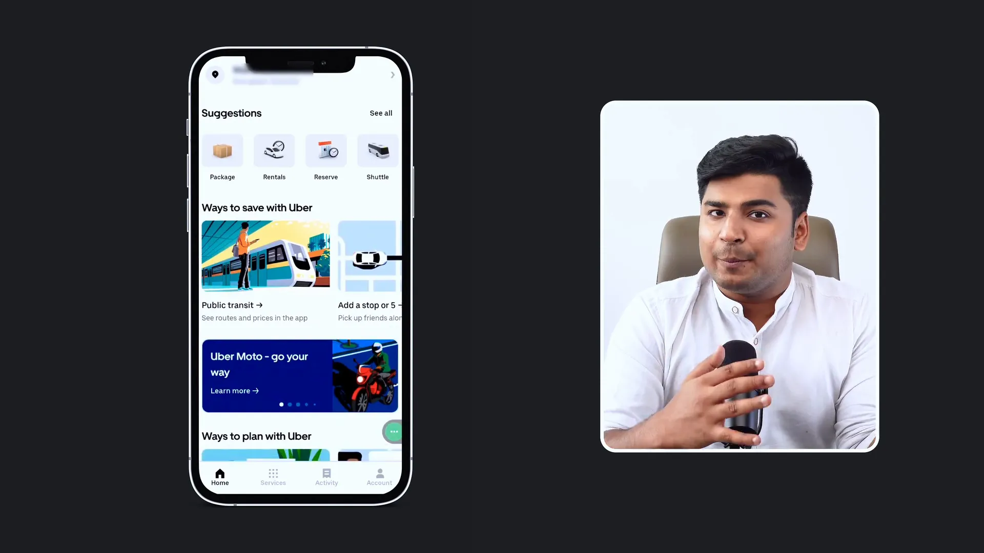
Uber’s app is a prime example of simplicity that is far from boring. Unlike many of its competitors such as Ola and Rapido, Uber has crafted a visually appealing interface using simple colors complemented by vibrant illustrations and icons. This design choice taps into the aesthetic usability effect, a psychological principle stating that users perceive aesthetically pleasing designs as easier to use.
Uber employs mostly black, white, and gray tones for text and backgrounds, creating a clean and readable interface. However, the colorful illustrations in sections like packages, shuttles, promos, and offers add personality and vibrancy to the app. This balance keeps users engaged and fosters a perception of the app as superior and user-friendly.
2. Doherty’s Threshold: Engaging Users During Wait Times
One challenge Uber faces is the wait time when finding a cab, which can take up to five minutes. If left idle, users might abandon the app or switch to a competitor. To combat this, Uber employs engaging illustrations and messages to keep users entertained during the waiting period.
This approach is grounded in Doherty’s threshold, a UX law that states if a system takes longer than 400 milliseconds to respond, users feel the delay is excessive. Uber’s strategy of displaying quirky, friendly messages and visuals fills this gap effectively. Similar tactics are used by apps like Zomato, which keep users entertained with humorous copy while loading content in the background.
3. Fitts’ Law: Optimizing Touch Targets for Easy Interaction
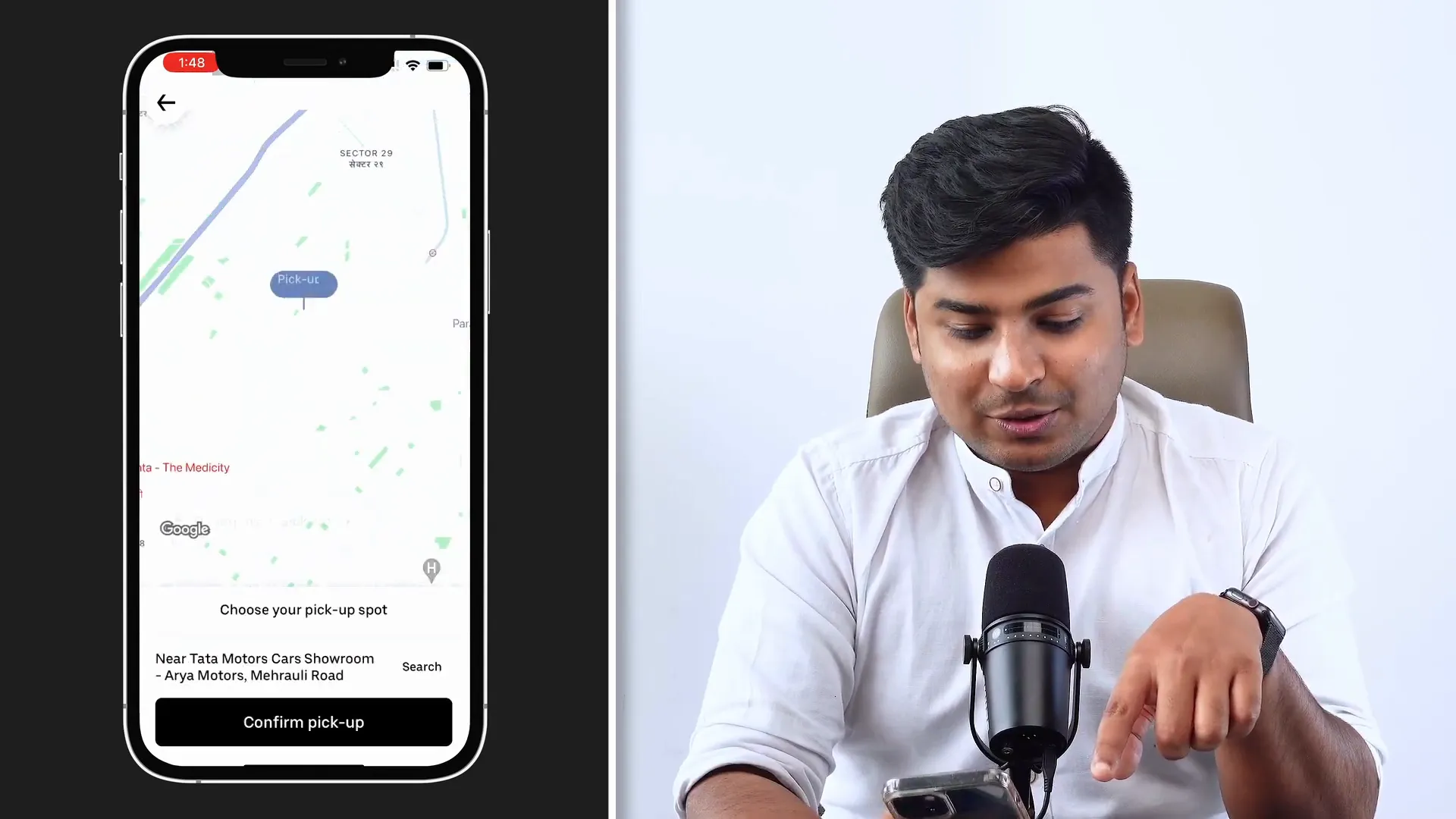
Uber’s app thoughtfully positions interactive elements where users can easily reach them with their thumbs, especially when selecting vehicles or confirming pickup locations. This design follows Fitts’ Law, which states that the time to acquire a target is a function of the distance to and size of the target. Simply put, bigger buttons closer to the thumb are easier to tap.
Most of Uber’s actionable buttons and options are located in the bottom half of the screen, minimizing thumb movement and making the app more comfortable to use on one hand. This thoughtful placement streamlines the booking process, allowing users to move seamlessly from one screen to the next.
4. Power of Defaults: Smart Option Presentation
When selecting a vehicle, Uber limits the visible options to three, with the default choice based on the user’s last selected preference. This leverages the power of defaults, a behavioral psychology principle where people tend to stick with default options rather than changing them.
This design reduces cognitive load by not overwhelming users with too many choices upfront, while still allowing access to all options through scrolling. Users can explore other vehicle types such as Airrickshaw or Uber Prime if desired, but the default nudges them towards their familiar choice—speeding up decision-making.
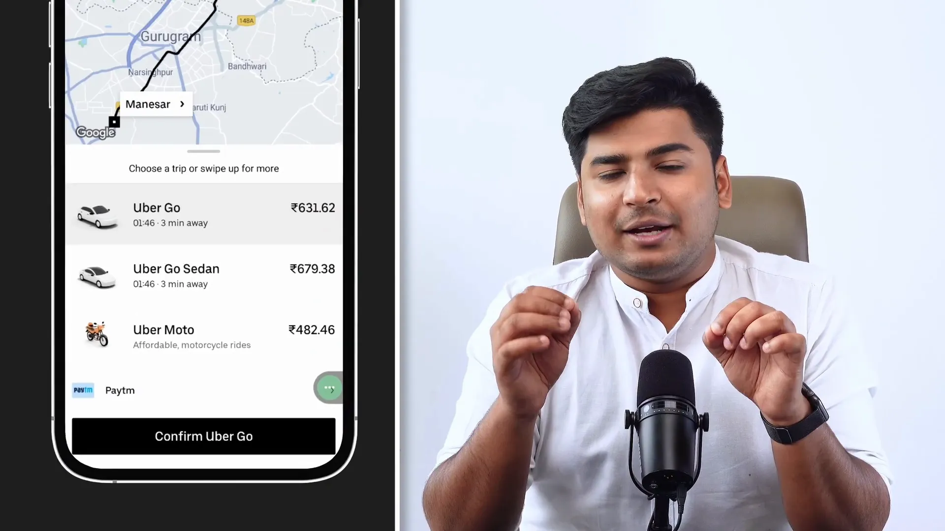
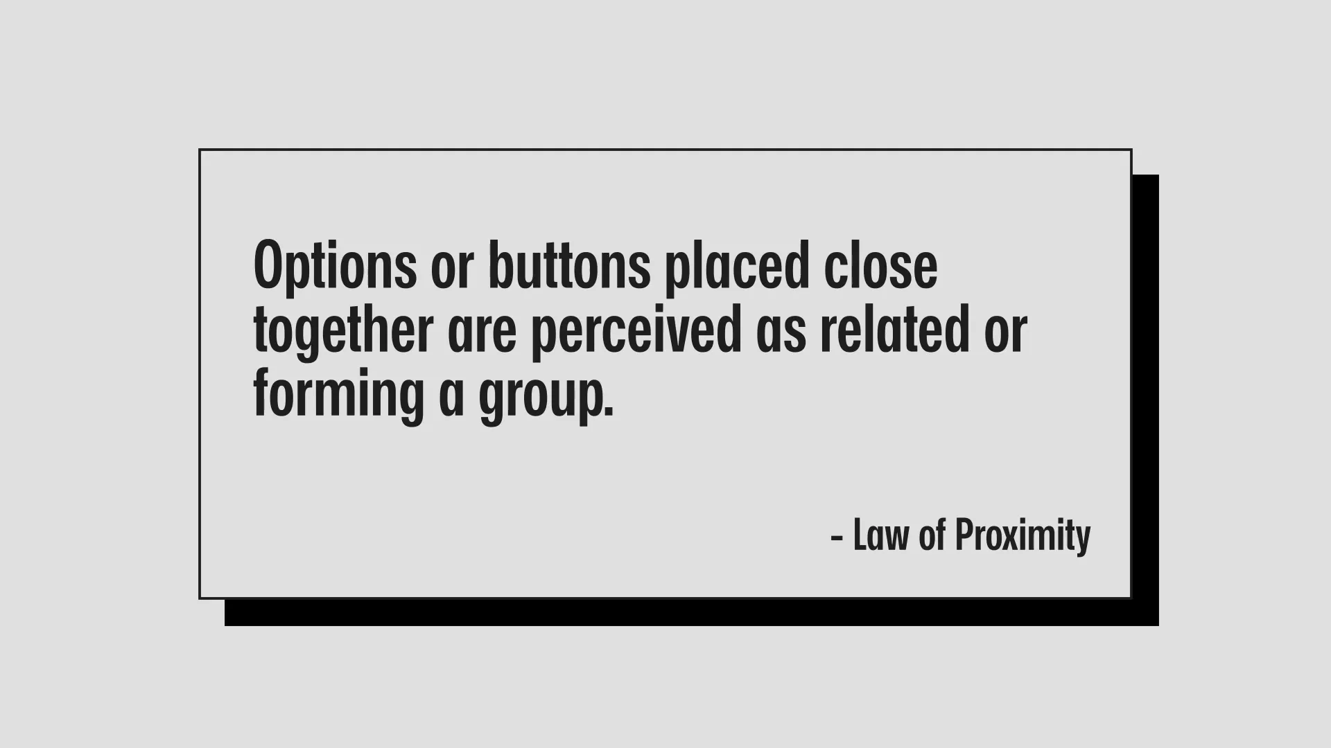
5. Laws of Proximity and Common Region: Clear Grouping for Better Comprehension
Uber skillfully applies the laws of proximity and common region to organize information visually. For example, pricing, estimated time, and vehicle icons are placed close together to be perceived as one cohesive option. This grouping helps users quickly associate related information.
In the account section, Uber uses gray backgrounds behind groups like Help, Wallet, Trips, and Safety Checkup to visually separate these from other elements. This is a practical use of the law of common region, where elements sharing a background or boundary are perceived as part of the same group.
However, not all parts of the app are perfect. For example, the “Your Trips” section sometimes confuses users because date, time, and pricing appear ambiguously related to the map above or below, showcasing a poor example of proximity.
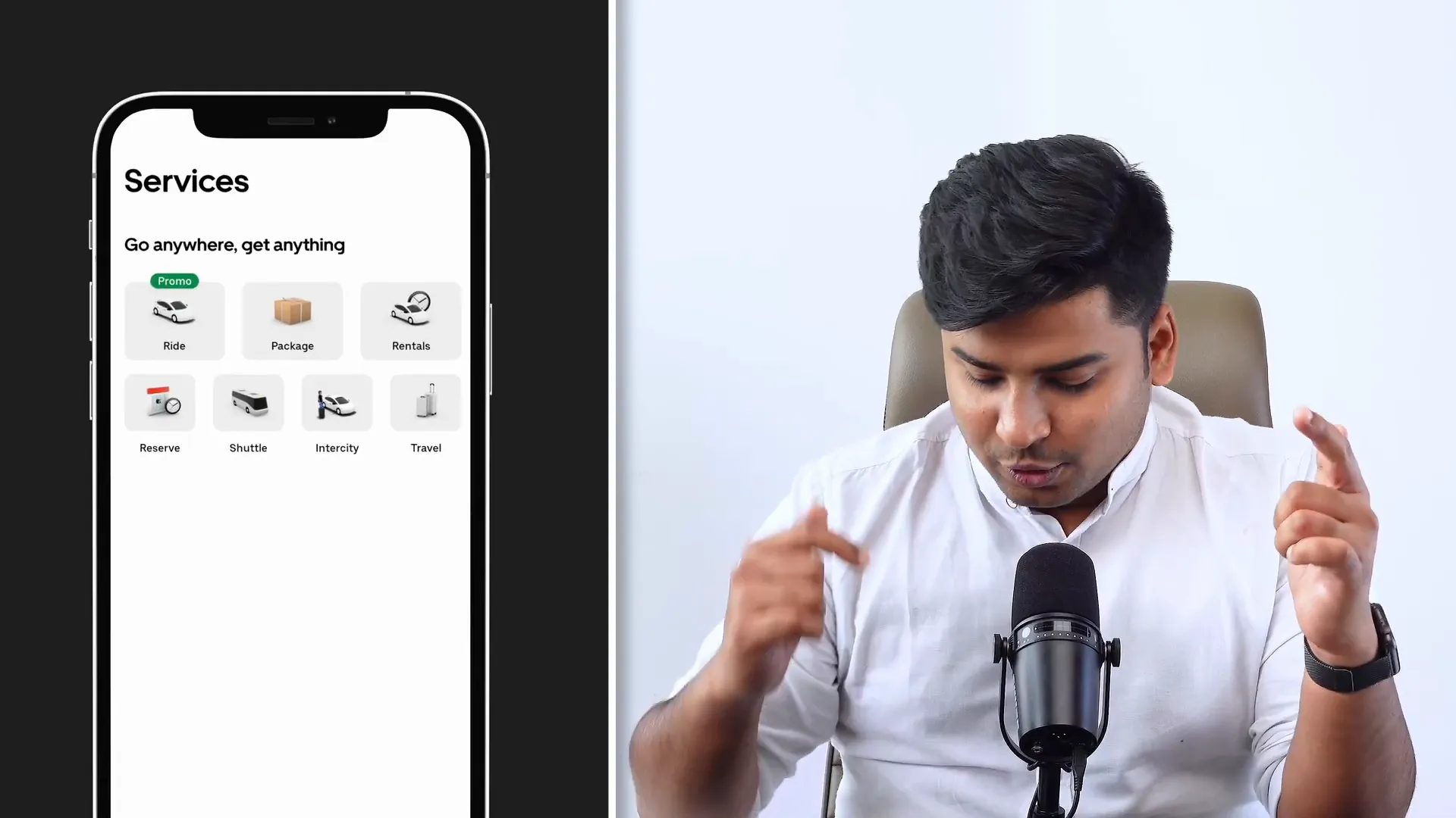
Bonus: Miller’s Law – Limiting Choices to Seven for Better Memory
Uber smartly limits the number of service options displayed to seven, aligning with Miller’s Law, which states that the average person can hold 5 ± 2 items in their working memory. By restricting choices to a manageable number, Uber ensures users can easily remember and navigate the services offered without feeling overwhelmed.
Conclusion
Uber's app is a masterclass in applying fundamental UX laws to create a seamless, enjoyable, and intuitive user experience. By leveraging principles like the aesthetic usability effect, Doherty’s threshold, Fitts’ law, power of defaults, laws of proximity and common region, and Miller’s law, Uber not only meets but exceeds user expectations.
These design choices are subtle yet powerful, influencing user behavior and satisfaction without overwhelming them. Whether you are a budding UX designer or someone looking to improve your app, studying Uber’s approach offers valuable insights into how UX laws can be practically applied to enhance usability and engagement.
If you’ve noticed other UX principles at play in Uber’s app or want to share your thoughts, feel free to leave a comment. And if you found this breakdown insightful, consider subscribing to the original creator Rohan Mishra on Design Sundays for more in-depth UX content.
Frequently Asked Questions (FAQ)
What is the aesthetic usability effect?
The aesthetic usability effect is a psychological phenomenon where users perceive aesthetically pleasing designs as easier to use, even if the functionality is the same. Uber’s app uses this by combining simple colors with vibrant illustrations to create an appealing interface.
How does Doherty’s threshold improve user experience?
Doherty’s threshold states that users feel a delay is too long if a system takes more than 400 milliseconds to respond. Uber keeps users engaged during wait times with entertaining messages and illustrations to make the wait feel shorter and prevent app abandonment.
Why is Fitts’ Law important in mobile app design?
Fitts’ Law helps designers position and size interactive elements to minimize the time and effort needed to tap them. Uber places buttons close to the thumb and makes them large enough to improve ease of use on mobile devices.
What is the power of defaults in UX?
The power of defaults refers to the tendency of users to stick with pre-selected options. Uber uses this by showing vehicle options based on the user’s last choice, reducing decision fatigue and speeding up the booking process.
How does Miller’s Law affect app design?
Miller’s Law suggests that people can hold around seven items in their working memory. Uber limits the number of service options to seven to make it easier for users to remember and navigate their choices.